Playing around with the NAF ranking system got me wondering how easy it would be to produce something similar for CCL (or potentially any BB2 league). Looking through the information about the Glicko rating system, there are several implementations of the Glicko2 algorithm the NAF has chosen to use, but unfortunately only the original Glicko algorithm is available as an R package. In order to try and match the NAF approach as much as possible I have therefore put together my own implementation of Glicko2 and can provide an initial look at the results today.
Introduction to the Glicko rating system
For those unfamiliar with Glicko rankings, I can recommend the explanation provided by the NAF. But for a very basic introduction, the Glicko system rates the strength of each player based on two values – a rating estimating their true ability, and a deviation that indicated the level of uncertainty around that rating. These can be viewed as distributions of ability representing the expected performance of a player. For example, a player with a rating of 1600 and deviation of 40:
p <- ggplot() + theme_nufflytics() + scale_y_continuous("",breaks = c(Inf), expand = expand_scale(mult = c(0,0.05))) + xlab("Ability")

plot_player <- function(rating, deviation, geom = "area", alpha = 0.5, ...) {
  stat_function(
    fun = dnorm,
    args = list(mean = rating, sd = deviation),
    data = data.frame(x = c(rating - 4*deviation, rating + 4*deviation)),
    aes(x = x),
    alpha = alpha,
    geom = geom,
    n = 301,
    ...
  )
}

p + plot_player(1600,40, fill = palette[1]) + ggtitle("Player A", "Rating 1600, Deviation 40")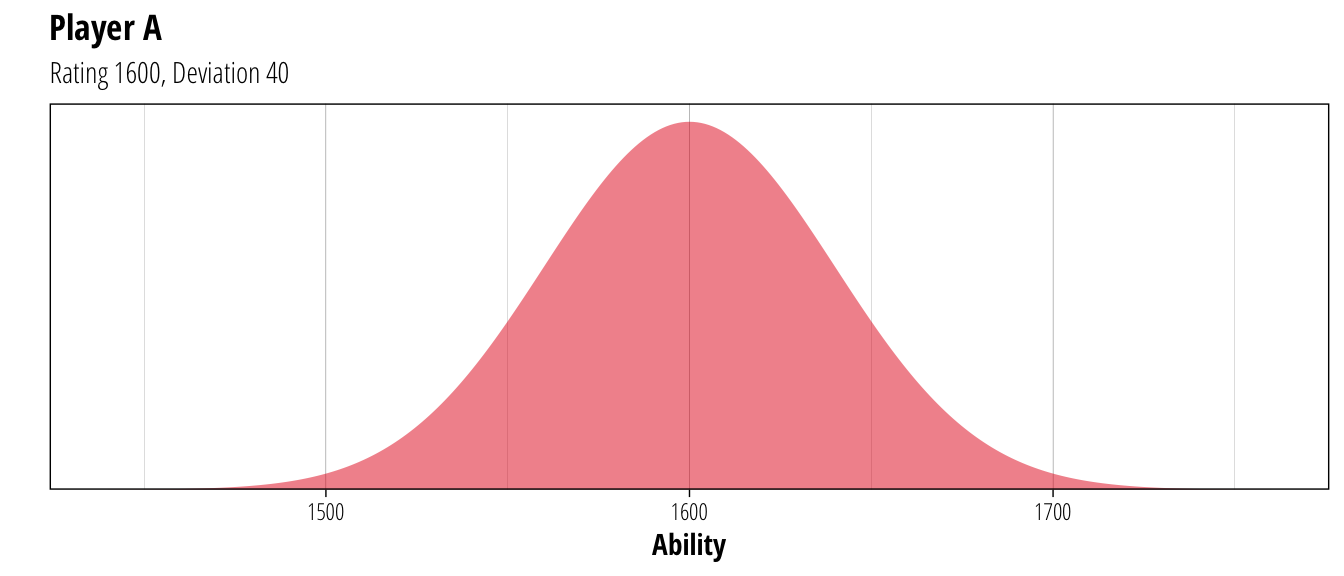
So while the best guess of Player A’s ability is 1600, the system believes that they could have a true ability somewhere between 1500 and 1700 although with decreasing likelihood as it gets further towards those extremes. When updating ratings after a match, both the rating and the associated uncertainty are taken into account. For example, if the player above played a match with lower rated player but who had higher uncertainty:
p +
  plot_player(1600,40, fill = palette[1]) +
  plot_player(1500, 100, fill = palette[[2]]) +
  ggtitle("Matchup", "A: 1600 +/- 40 \nB: 1500 +/- 100")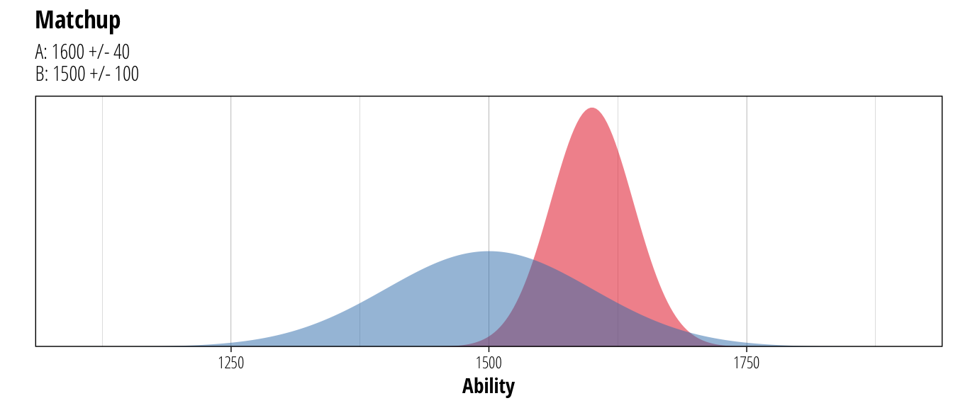
While Player A is the stronger player (predicted to win about 63% of the time), the uncertainty around Player B’s rating means that there is a small possibility that they might have a true rating of around 1750 (or equally probable that it might be 1250). Since we are less certain about Player B’s true ability, the system is more aggressive about updating ratings after a game. For Player A, the rating isn’t altered as much after a game because the system is more certain about A’s ability and will need more results showing a consistent trend in increasing or decreasing skill before changing the rating much. To show this feature in action, consider the possible outcomes from the above match (ignoring draws)
A_wins <- p +
  plot_player(1600,40, colour = palette[1], geom = "line", alpha = 1) +
  plot_player(1500, 100, colour = palette[[2]], geom = "line", alpha = 1) +
  plot_player(1603,39.8, fill = palette[1] ) +
  plot_player(1481, 96.5, fill = palette[2]) +
  ggtitle("Player A wins", "A: Rating + 3\nB: Rating - 19")

B_wins <- p +
  plot_player(1600,40, colour = palette[1], geom = "line", alpha = 1) +
  plot_player(1500, 100, colour = palette[[2]], geom = "line", alpha = 1) +
  plot_player(1594,39.8, fill = palette[1] ) +
  plot_player(1534, 96.5, fill = palette[2]) +
  ggtitle("Player B wins", "A: Rating - 6\nB: Rating + 34")

plot_grid(A_wins, B_wins, nrow = 1)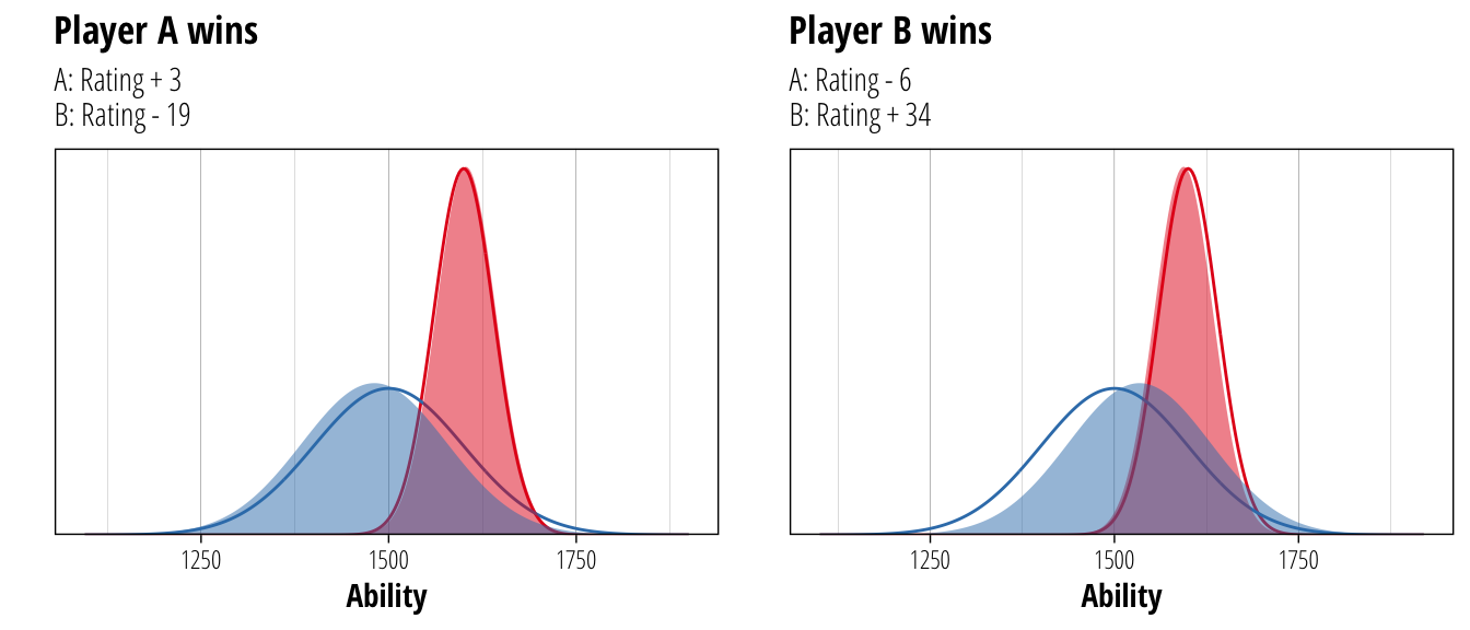
The original ratings are shown as a solid line, while the updated ratings after each result are shown as the filled distribution. Player B’s rating shifts more than Player A whatever the result, and more improbable results shift both players further than results that are expected. Because we now have a little bit more information about each player, we can also be more certain about their ability. The deviation of Player A decreases from 40 to 39.8 and that of Player B decreases from 100 to 96.5.
Glicko for CCL
So with a basic description of the system out of the way, what does it look like when you apply Glicko ratings to CCL? First we’ll need some match results to use, so a quick trip to GoblinSpy nets us ~6GB of databases containing results from CCL seasons 1-17. We break these into two sets, one large set containing all matches up to 18th June 2018 (209,265 matches between 11,363 coaches) that we will use to tune some of the Glicko parameters, and one smaller set from the 19th June until now (21,664 matches between 3,129 coaches) that we will use to test how well these rankings can predict match results.
Because my Glicko2 implementation is fairly slow (~15 minutes on the training dataset), our ability to optimise parameters is somewhat limited. The combination that ended up working best was using initial ratings for each player of 1500, with a deviation of 200 and a volatility (\(\sigma\) in the Glicko2 formulae) of 0.04. This volatility measure determines how aggressively the deviation of a player is adjusted, with more erratic performances leading to an increase in a player’s deviation. The system parameter \(\tau\) (which affects how quickly a player’s volatility score is changed) was 0.5.
These settings were arrived at after running a number of tests over plausible parameter ranges. The rankings were calculated over the training data and then the ratings were used to predict the outcomes of all games in the training set (ie. the final ratings were used to predict all the games that went into making them). The selected parameter settings were the ones that were best able to predict match results.
Assessing predictive performance
To get some idea of how well this rating system works at predicting match results, we can take the ratings from the training dataset and use them to predict the ~21,000 matches kept aside for testing.
trained_rating <- glicko2(train_data, default_player = c(1500, 200, 0.04), tau = 0.5, history = T)

match_predictions <- glicko2_predict(trained_rating, new_games = test_data, default_player = c(1500, 200, 0.04), tau = 0.5)
So how well are we able to predict match results using nothing but the ratings of the two coaches? If we ignore draws and look only at how well we select the winner of a match, we can correctly predict 65.16% of matches.
match_predictions %>%
  filter(result != 0.5, prediction != 0.5) %>%
  mutate(prediction = case_when(
    prediction < 0.5 ~ 0,
    prediction > 0.5 ~ 1)
  ) %>%
  xtabs(formula = ~result+prediction) %T>%
  {dimnames(.) <- list(`Actual Result` = c("Loss", "Win"), Prediction = c("Loss", "Win"))}
## Prediction
## Actual Result Loss Win
## Loss 5175 2688
## Win 2852 5185Now 15% better than flipping a coin might not seem that great, but in a game like Blood Bowl with a significant random component it’s pretty good given that we are considering only the identity of the two coaches and nothing about the teams they are playing. A better way to look at the success of the rating system is to assess how well it can make probabilistic predictions about the result of a game. The actual prediction it produces is not a binary win/loss outcome, but a value between 0–1 representing the expected value of the game for the home team where a win counts for 1, a tie for 0.5 and a loss for 0. If the rating system is doing it’s job correctly, it should be more likely that the away team wins a 0.6 game than a 0.9 game. This would suggest that the system is accurately picking up the underlying uncertainty in game outcomes and correctly calculating the probability of either team winning the match.
For the CCL ratings, this looks as follows (removing games where neither player has a rating in the system):
match_predictions %>%
filter(player1 %in% names(trained_rating$rating) | player2 %in% names(trained_rating$rating)) %>%
mutate(bin = floor(prediction/0.05)/20) %>%
ggplot(aes(x = prediction, y = result)) +
geom_point(position = position_jitter(height = 0.1), alpha = 0.05) +
geom_abline(intercept = 0, slope = 1, linetype = "dashed") +
stat_summary(aes(x = bin + 0.025), fun.data = mean_cl_boot, colour = palette[1])+
scale_y_continuous("Home Team Result", breaks = c(0,0.5,1), labels = c("Loss", "Tie", "Win")) +
xlab("Predicted Result") +
ggtitle("Predicted vs. Actual Result", "Summarised across 5% probability bins")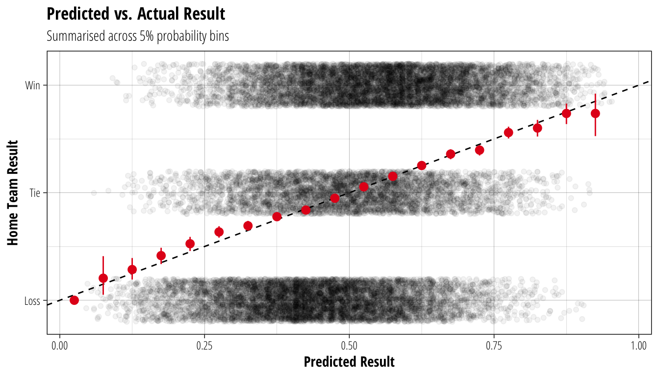 The black points each represent an individual game in the test data, with the y-axis showing the actual outcome for the home team and the x-axis showing the predicted outcome using the rating of the two coaches. The dashed line shows a theoretical 1:1 relationship between predicted and actual results, while the red points show the averaged outcomes (with 95% confidence intervals) across 5% bins of predicted outcomes. The close relationship between these two suggests that the rating system is able to identify the probability of different game results, ie. across 10 games where the home team is predicted to win 60% of the time, we should expect the home team to win 6 times (ignoring the effect of ties).
We have been ignoring ties up until now, but can our ratings help to predict those as well? About 22% of matches in the test dataset ended up as ties, and from our previous analysis, that proportion is remarakbly stable across a wide range of TV differences. One hypothesis could be that ties are more likely between evenly matched coaches, with imbalanced matches more likely to produce a definitive result.
match_predictions %>%
  filter(player1 %in% names(trained_rating$rating) | player2 %in% names(trained_rating$rating)) %>%
  mutate(bin = floor(prediction/0.05)/20, result = result%%1/0.5) %>%
  ggplot(aes(x = prediction, y = result)) +
  geom_smooth(method = "lm", formula = y~x+I(x^2), colour = "black", se = F, linetype = "dashed") +
  stat_summary(aes(x = bin + 0.025, group = bin), fun.data = mean_cl_normal, colour = palette[1]) +
  ggtitle("Proportion of ties by predicted outcome") +
  xlab("Predicted Result") + scale_y_continuous("Proportion of Ties", label = scales::percent)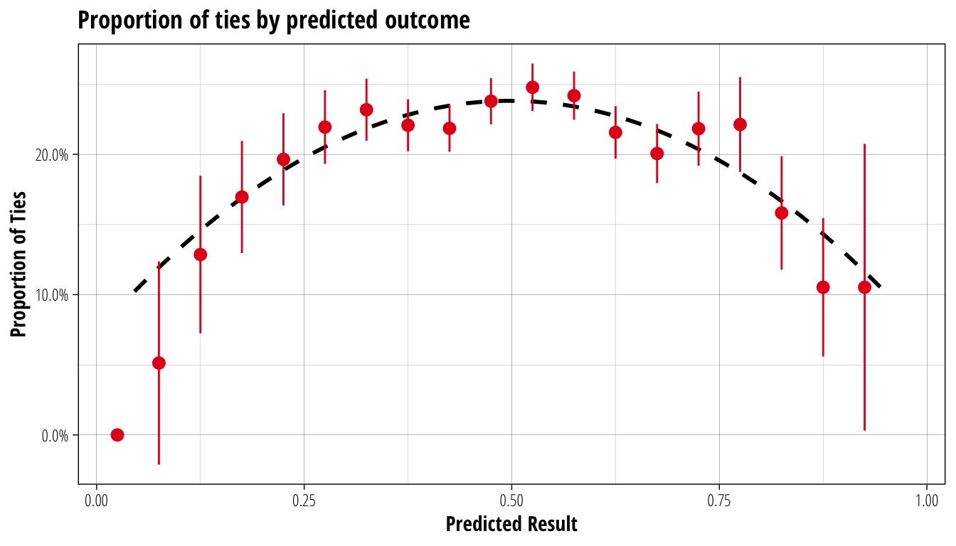
In red are the proportion of ties across the same 5% bins as before (with 95% confidence intervals), while the dashed black line is a simple fitted quadratic function. Again, the fit is not exact but it is certainly close enough that we can definitely say there is a connection between the difference in playing strengths of each coach and the probability that a game ends in a tie. Specifically, from the quadratic fit, the probability of a tie is equal to 0.66 times the predicted result less 0.66 times the square of the predicted result.
Since the predicted result is just the probability of a home team win plus half the probability of a tie, we can therefore easily produce probabilities for all three outcomes. If the predicted result for a match is 0.6, we expect the home team to win 48.4% of the time, the away team to win 28.5% and the match to end in a tie 23.1% of the time. In a very unbalanced match (predicted result of 0.85), the home team should win 77.2%, the away team 7.3%, and 15.5% of matches ending in a tie.
The actual rankings
Now that we have satisfied ourselves that this rating system does a decent job of predicting actual match results, we can update the ratings with the matches in the test dataset to get a final ranking.
ccl_ranking <- glicko2(test_data, old_rating = trained_rating, default_player = c(1500, 200, 0.04), tau = 0.5, history = T)In order to compare coaches, we will rank them based on their rating minus the associated uncertainty value. This gives us some idea of how strong the coachs is, while also considering how certain we can be about that strength estimate. The NAF rankings use a slightly different approach, which subtracts two and a half times the uncertainty from the rating value for ranking. The main reason for this difference is that unlike the NAF rankings which are updated monthly, the CCL rankings were updated on a daily cycle. The effect of this is that the CCL ranking deviations are more likely to be affected by a player taking a few weeks off or cramming a lot of games into a short space of time, and so we will pay a little less attention to the rating deviation for ranking purposes.
So taking all that into account, the CCL rankings as of 20th August 2018 are:
ccl_ranking$rating %>%
  map_df(as_data_frame) %>%
  mutate(ranking = rating - deviation) %>%
  arrange(desc(ranking)) %>%
  select(name, ranking, rating, deviation, tot_games, inactivity) %>%
  head(12) %>%
knitr::kable(rownames = F, digits = 2, col.names = c("Coach", "Ranking Score", "Rating", "Rating Deviation", "Total Games", "Inactive Days"), align = "l") | Coach | Ranking Score | Rating | Rating Deviation | Total Games | Inactive Days |
|---|---|---|---|---|---|
| AndyDavo | 1769.21 | 1819.80 | 50.59 | 547 | 1 |
| ducke | 1741.22 | 1804.69 | 63.47 | 930 | 12 |
| coldy | 1739.19 | 1822.51 | 83.32 | 254 | 0 |
| Crucifer | 1735.37 | 1786.54 | 51.16 | 1770 | 2 |
| SamDavies | 1726.70 | 1837.63 | 110.92 | 323 | 67 |
| l120cible | 1725.11 | 1780.73 | 55.62 | 545 | 7 |
| Aldreya | 1723.79 | 1787.32 | 63.53 | 388 | 17 |
| Fatyn | 1722.11 | 1772.26 | 50.15 | 604 | 3 |
| Lawthrall | 1719.05 | 1775.27 | 56.22 | 190 | 7 |
| Vajajava | 1716.22 | 1795.39 | 79.17 | 208 | 26 |
| Sean-18 | 1708.50 | 1761.54 | 53.04 | 866 | 0 |
| Mankiz | 1708.41 | 1802.99 | 94.58 | 352 | 125 |
I’m sure that many of these names will be unsurprising for people who follow CCL closely, with most of them making several appearances in the Champions Cup. Since we have retained the historical information in creating these ranking lists, we can also look at how a coach’s form has changed over time:
plot_coach <- function(coach) {
  rating <- ccl_ranking$rating[[coach]]

  historical_ratings <- ccl_ranking$history %>%
    filter(name %in% coach, tot_games > 10) %>%
    mutate(period = lubridate::as_date(period))

  historical_ratings %>%
    ggplot(aes(x = period, y = rating)) +
    CCL_backdrop() +
    geom_tile(data = deviation_density, aes(y=y, alpha = dens, height = (max(y)-min(y))/60)) +
    geom_line(data = filter_inactive, colour = "white") +
    geom_rug(data = filter_unplayed, aes(colour = period_games), sides = "b") +
    scale_color_viridis_c("Games Played") +
    scale_alpha_continuous(range = c(0, 0.2), guide = "none") +
    coord_cartesian(xlim = range(historical_ratings$period)) +
    xlab(NULL) +
    ylab("Rating") +
    ggtitle(coach, glue::glue("Rating: {round(rating$rating, digits=2)}, Deviation: {round(rating$deviation, digits=2)}"))
}

plot_coach("AndyDavo")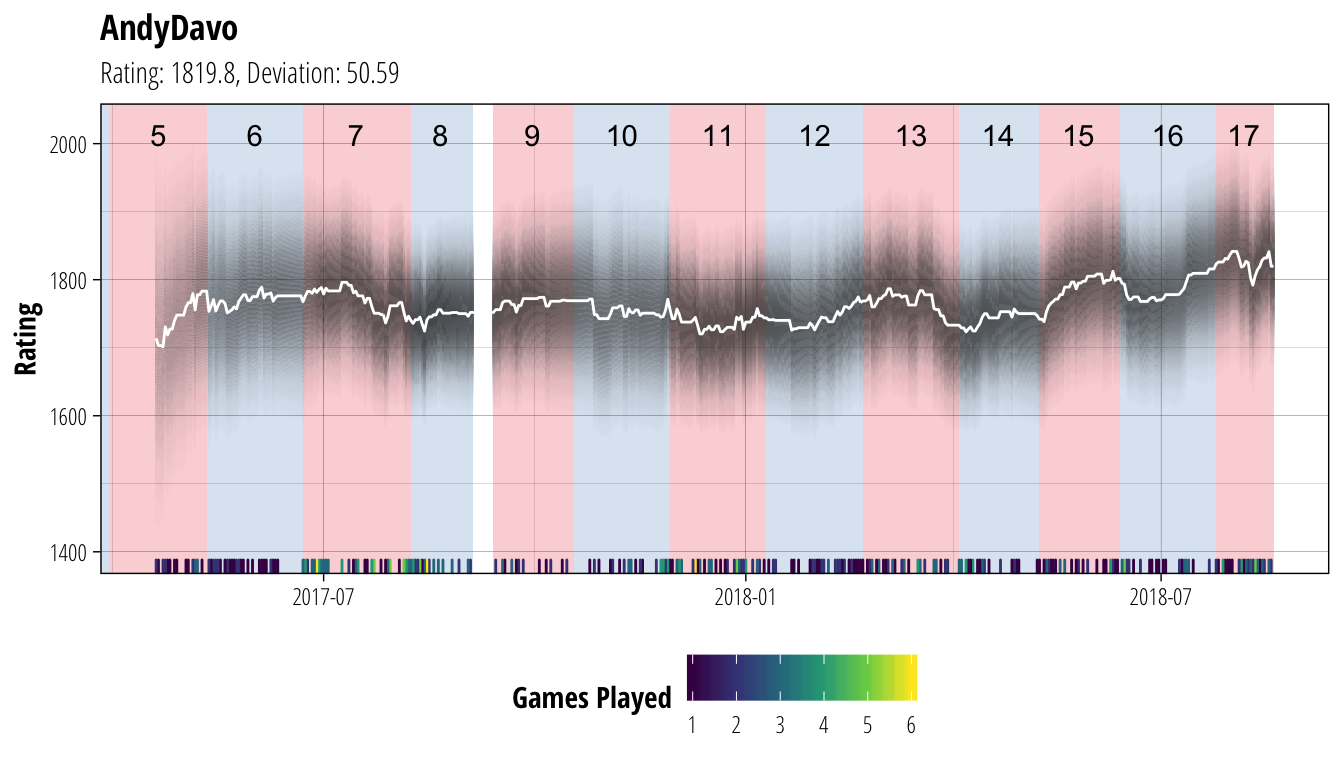
plot_coach("ducke")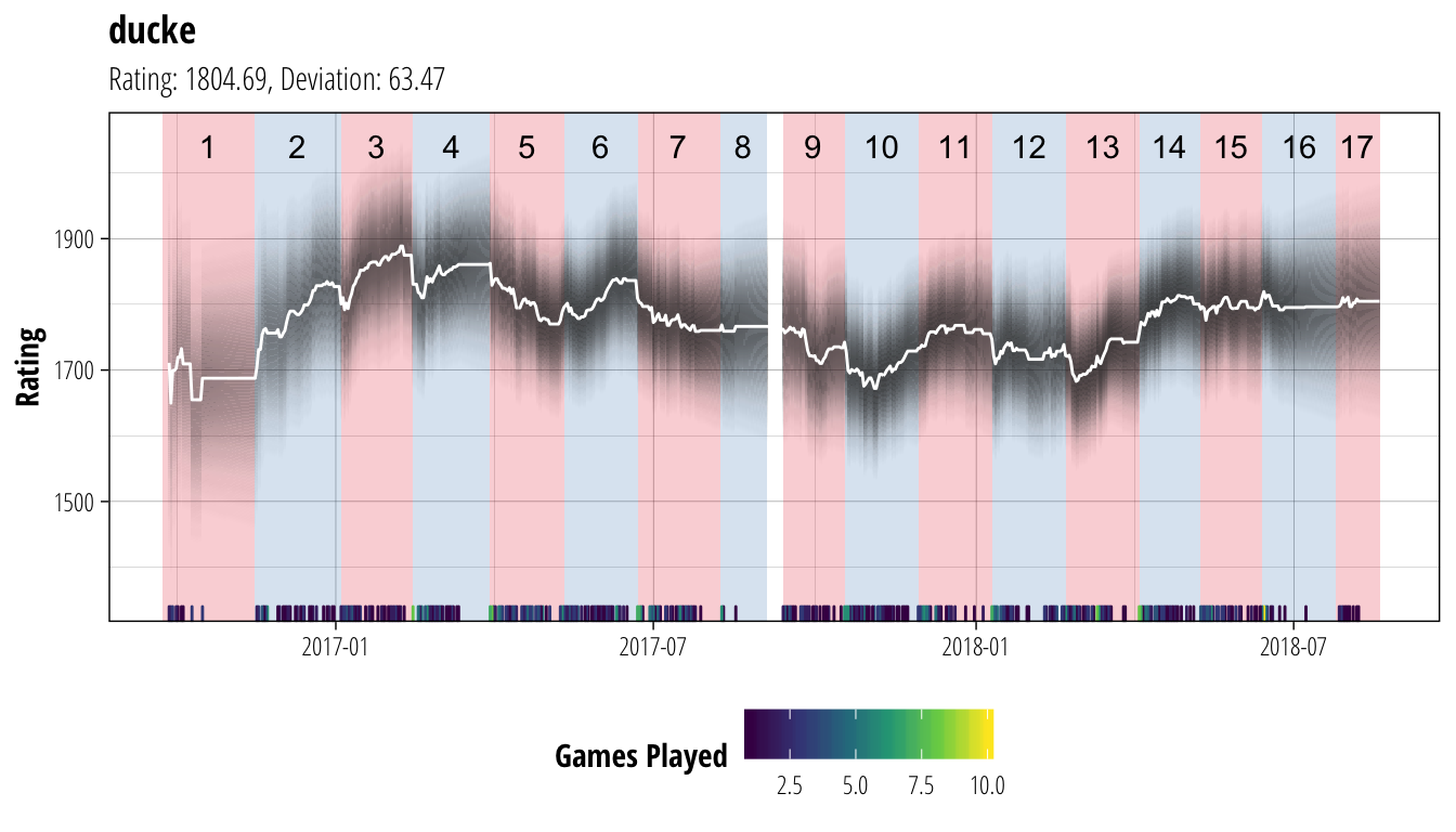
plot_coach("coldy")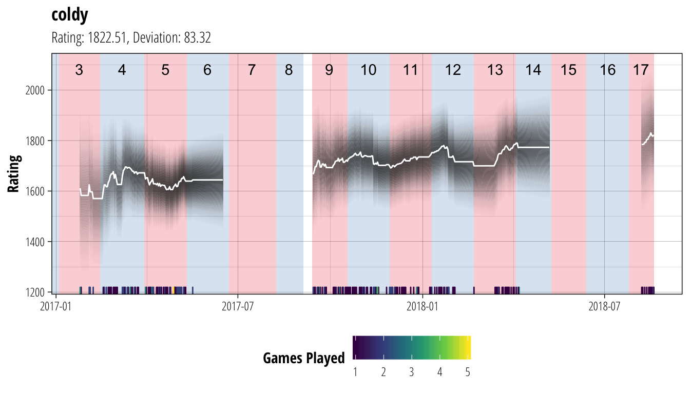
plot_coach("Crucifer")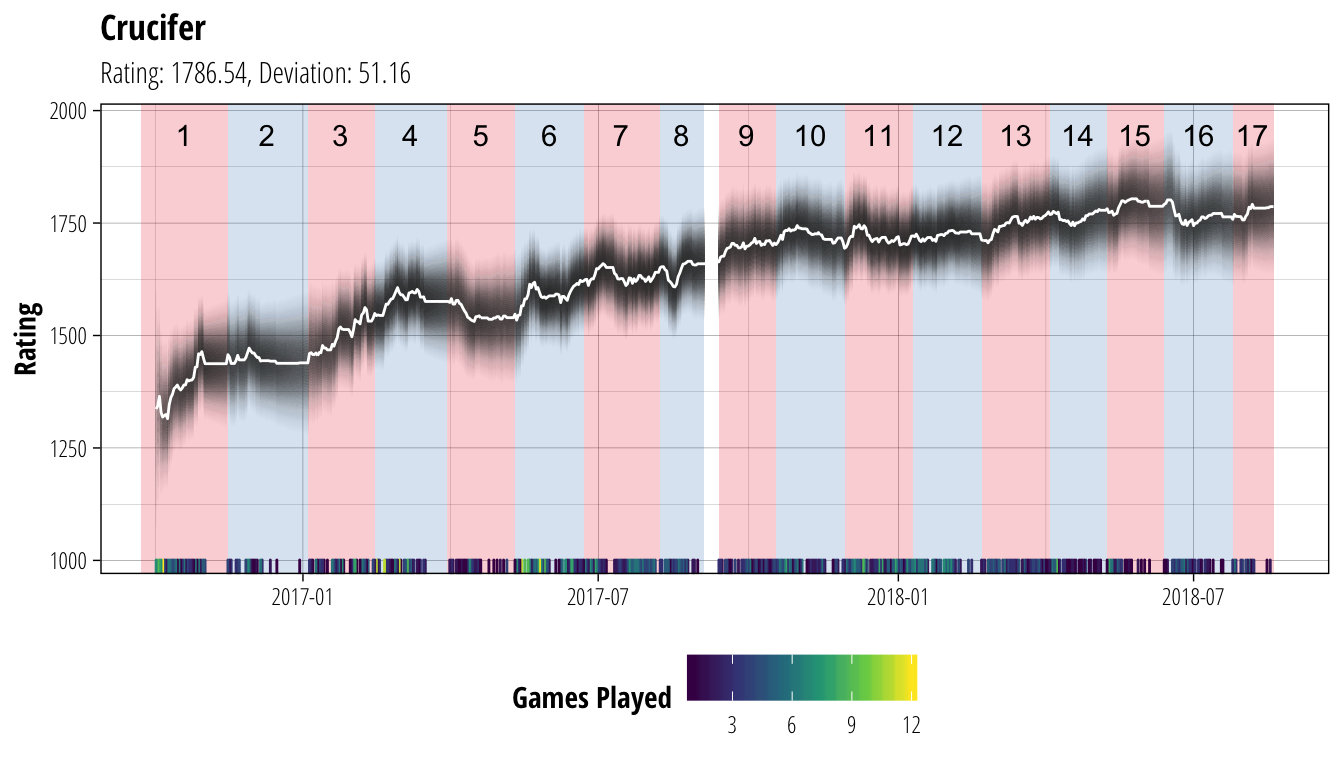 In each of these plots, the white line shows the coach’s rating (ie. our best guess of their current ability), while the dark bands show the associated uncertainty. Darker bands indicate that we are more certain about a player’s rating (equivalent to the narrower distribution of Player A’s ability back in the second figure). We have chosen to not show ratings until a player has played at least 10 matches to avoid the early period where ratings can be very volatile, and are not showing ratings for periods where a player has gone for more than 30 days without playing a match. At the bottom of each plot is a heatmap of the number of games the coach has played on each gameday, and the red/blue sections of the background show the extent of each CCL season.
While these rankings are currently static, over the next few weeks I will be working on automating a daily download of results to create a live updating table allow everyone to produce their own plots like the ones above. If you absolutely can’t wait to see where you sit, feel free to visit the work in progress site, although it only has basic functionality at the moment.
Share this post
Twitter
Google+
Facebook
Reddit
LinkedIn
StumbleUpon
Email