Recently, the NAF implemented a new rating system alongside their old Elo system. The stats nerd in me immediately got excited because the new approach uses the Glicko system (excellent introduction to the implementation here) which uses both a player’s estimated ability as well as a measure of how uncertain that estimate is. This should allow us to do a few interesting things beyond a basic leaderbaord.
Seeing that all the code was available and that it stores historical ratings along with the current snapshot (now removed from the repo because it’s a large file but still accessible if you know where to look) I decided to have a play around and see if we can visualise them. The first goal I had going into this was to
- Show how the rating of a player/race combination changes over time
The NAF have decided to calculate a rating as \(\mu - 2.5\phi\) (\(\mu\) and \(\phi\) being the two values calculated with the Glicko system). Essentially, this sets a player’s rating equal to a value which we are almost certain their true strength excedes. While I can understand the reasoning behind this decision, it can potentially lead to some odd outcomes where players lose games but their rating will go up (because we become more certain about their true rating and so \(\phi\) decreases enough to counteract the falling \(\mu\)).
These potential quirks of the system led to the my second goal:
- Show how the underlying algorithm leads to the ranking value
Since \(\mu\) and \(\phi\) are effectively the mean and standard deviation around our estimate of the true ability of a player, this essentially means we just need to find a way to show this distribution and how it results in a given rating.
Rating over time
The first step will be a simple one, just plot the rating of a player over the recorded timeframe. We’re going to be working with the rankings from Pipey for the rest of this post (simply because being on the front page of the rankings with three different races seemed like a worthwhile achievement when I was scanning for an example to use)
library(rhdf5) # to load the .h5 data file
ranking_file = str_c(data_dir, "rankings.h5")

# data in the .h5 file are stored as a matrix  per coach
# with races as rows and dates as columns
# we need them in a tidy format for plotting
tidy_data <- function(data, r_name, c_name) {
  data <- data %>%
    as_data_frame() %>%
    magrittr::set_colnames(c_name) %>%
    mutate(race = r_name) %>%
    gather(date, ranking, -race) %>%
    filter(!is.nan(ranking)) %>%
    mutate(date = lubridate::ymd(date))
}

ranking_data <- h5read(ranking_file, "coaches/Pipey") %>%
    map(tidy_data, h5read(ranking_file, "race_ids"), h5read(ranking_file, "date")) %>%
    cbind() %>%
    bind_cols() %>%
    select(race, date, mu = "ranking", phi = "ranking1") %>%
    group_by(race) %>%
    arrange(date) %>%
    mutate(last_date = lag(date))
  H5close()

base_rating_plot <- ranking_data %>%
  ggplot(aes(x = date, y = mu - (2.5*phi))) +
  facet_wrap(~race) +
  labs(title = "Glicko rating", subtitle = "Pipey", x = "", y = "Rating")

base_rating_plot + geom_line(size = 0.5)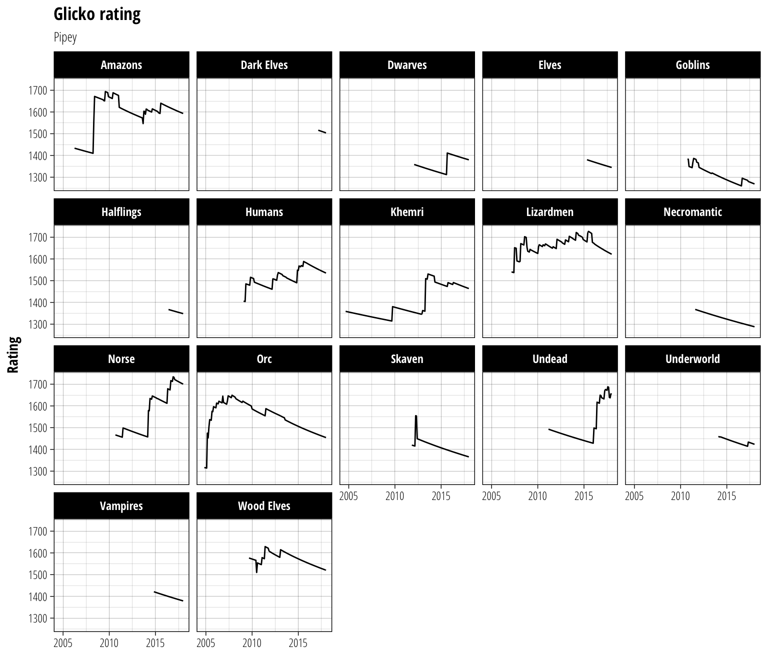
The most striking feature of these plots is probably the long periods with a steady decrease in rating. This is because if a player does not record any matches with a given period (one month for the NAF data), their \(\phi\) value is increased slightly. This indicates that we can be less and less certain about their predicted ability the longer they go without playing and so their rating decreases as a consequence.
True ability distribution
Now that we have the rating displayed, it’s time to work on the underlying distribution. Using \(\mu\) and \(\phi\) we can calculate the probability that a player’s true ability lies at a particular point. We will map this onto the alpha aesthetic, meaning that more intense areas of colour will have a higher probability of containing the true ability of a player.
#Need a function to compute the probability density data
#Has to be a better way to do this but it works for now
density_data <- function(d, bins) {
  dens_data <- data_frame(
    date      = rep(d$date, each = bins),
    last_date = rep(d$last_date, each = bins),
    race      = rep(d$race, each = bins),
    mu        = rep(d$mu, each=bins),
    phi       = rep(d$phi, each = bins),
    y         = map2(d$mu, d$phi, ~seq(.x-.y*3, .x+.y*3, length.out = bins)) %>% unlist # $bins points evenly spaced mu +/- 3 phi
  )

  dens_data %>%
    group_by(date,race) %>%
    mutate(dens = dnorm(y, mean=mu, sd=phi)) # normal density at each bin
}

distrib_plot <- base_rating_plot +
  geom_rect( # Hidden skill probability distribution
      data = function(d) density_data(d, bins = 500),
      aes(xmin = last_date, xmax = date, ymin = y, ymax = lead(y), alpha = dens, group=race),
      colour=NA,
      fill="black"
    ) +
  scale_alpha_continuous(range = c(0,1)) +
  labs(y = "True Ability") +
  theme(legend.position = "none")

distrib_plot
That makes me feel a bit dizzy after staring at it for a while, but I think it does a good job of conveying the uncertainty that the Glicko system tries to capture.
Final product
It’s now time to add a few extra touches to the figure. We’ll add line representing \(\mu\) in the middle of the probability distribution and the player rating from the previous figure to bring all the components of the ranking together.
distrib_plot +
  geom_line(aes(y = mu), colour = "white", size = 0.3) +
  geom_line(size = 0.5) +
  labs(y = "Rating")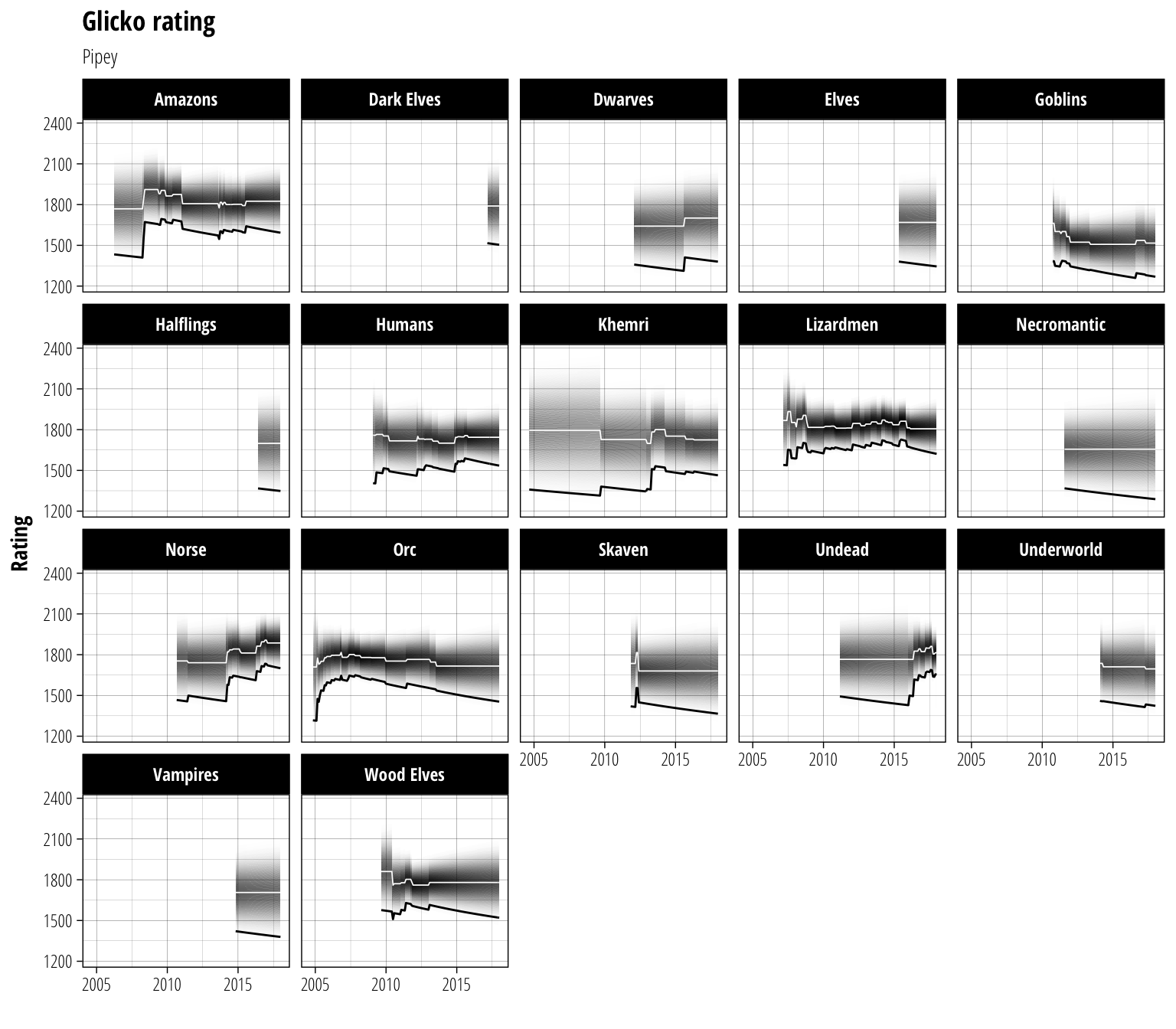
And there we have the complete history of the rating for a coach using the NAF’s new system. If you care about being #1 on the ranking list, focus on the black line. If you care about what the predicted true strength of a player is, focus on the white line and distribution. One of the nice things about this way of visualising the data is that it is able to distinguish between regions where a player’s rating has risen due to a true improvement (both \(\mu\) and the rating rise) and regions where a rating has risen due to gaining greater confidence in a previous estimate of ability (\(\mu\) stays relatively steady but \(\phi\) shrinks, causing the rating to rise).
Ratings on demand
Of course, being able to do this once off is fine, but what about the rest of the coaches in the dataset? Everyone is going to want to look up their favourite coach or their next opponent (let’s face it though – first off will be a quick vanity search). Luckily, we are all set up to feed your curiosity right here.
Share this post
Twitter
Google+
Facebook
Reddit
LinkedIn
StumbleUpon
Email